info@edesiakbs.com
 781.238.8800
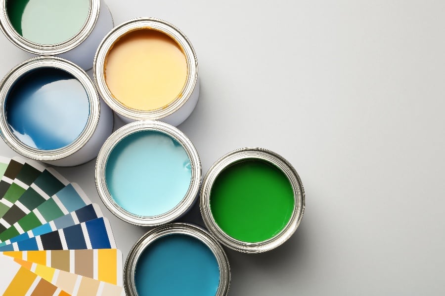
Everyone knows that a fresh coat of paint can transform a house back to a like-new look and feel. Fresh, unscuffed walls in modern neutral colors can turn a space from lived-in to uplifting.
However, knowing the right "modern" paint palette is more challenging than it sounds. Truly trendy colors come and go, and bold colors can really date a home, especially when you're not sure when the next repainting will be.
How do you choose paint colors for your home that never go out of style? There are two key elements to this decision. First, aim for a timeless look that doesn't rely on bold, colorful trends. The second is to understand your architecture and decoration style. A home that feels put-together will always feel more timeless.
Let's take a look at a few paint palettes that are always in style when used correctly.
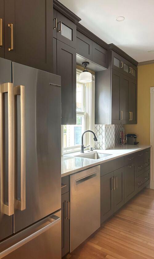
Warm Gray or "Greige"
If you work outside of real estate, you may have never heard the term "Greige". This means a mix of gray and beige, and it's pigment's gift to neutral decor. Greige is, essentially, a warmish gray paint with a very faintly yellow or orange hue. Greige warms up gray walls just a little so they feel more welcoming and reflect yellow light from bulbs and fireplaces more pleasantly.
Gray is a very elegant color, but too much cool gray to charcoal is straight out of the 2010s and a style that didn't profoundly last. Instead, use warm grays or "greige". Use your choice of gray highlight to open the door to accent colors, or accent with white or charcoal for a more monochrome look.
Moss to Green-Gray
If you'd like just a touch of color in your neutral decor, gray-green has been trending for the last few centuries. The soft color of moss to green-tinted gray adds a hint of nature to your decor and is easy on the eyes. Humans like seeing shady green, and the color of underbrush in shadow helps us to relax. Gray-green is a popular color as an accent in neutral nursery or kitchen designs without overpowering the space with a bold color a dated style.
Gray-green also opens the door to a far greener or nature-themed decor style. Whether you want to add a few indoor plants or a theme of more vibrant green throw pillows and furniture details, gray-green, moss, and greenish-gray make a soothing and timeless palette.
Palette of Creams
One thing you may notice is that homes with more than one paint color are more immersive and less flat-looking from one room to the next. However, the rule of neutrals suggests not using any color that is too strong or recognizable. This is where the palette of creams comes into play. Creams are warm whites, a little yellow ranging from ruddy to gently sunny. Each room glows with warmth, but using a mix of colors will make the entire space feel more alive instead of each wall and room being the same.
The 2023 leading trend of honey, amber, and ginger-orange is a stronger variation of your cream palette, which makes it very adaptable to current warm paint palette trends.
Environmentally Hued White
If you're thinking about a brilliant white, stop and consider undertones. Every white has an undertone, or hue. Whites with a yellow undertone are warmer, closer to cream, while whites with a blue undertone are cooler and lean toward very pale gray. Stark white is rarely used, and is not easy on the eyes for most residents. Even gleaming minimalist design tends to use soft differences in texture and undertone, like cream marble and gray carpet.
Instead of plain white, let your architecture and decor style be your guide. Choose an undertone that matches the beams of your home and the subtle color themes in the fixtures and features that you won't be painting. This way, your home's colors seem to unify even in the white walls.
Navy and Dusty Blue
If you're looking for a darker splash of color, navy blue is the most timeless color choice in home decor. Favored particularly in coastal and New England homes, navy blue is also a soothing neutral dark hue for kitchens and doorframes that most people will find elegant and formal rather than bold. Navy blue and softer dusty blues in the same color range give a sense of formality, but can be used more cheerfully in color schemes that blend in brighter blues and greens.
Ultimately Timeless Color: Match Your Architecture
The best tip we can give when choosing a timeless look for your home interior is to match your architecture. Ochre paint may look 70s in a modern apartment, but looks perfect as an accent in Tuscan-style homes. Greige and white paint both look best when those subtle undertones match the color of the wood, fixtures, and furniture in your home. If you choose a subtle color detail like green or gray, carry those themes into your interior accents with curtains and throw pillows that bring the whole room together.
As kitchen and bath renovation pros, we've put together more than a few beautiful (and beautifully painted) spaces. For more insights on home decoration and design, contact us today!